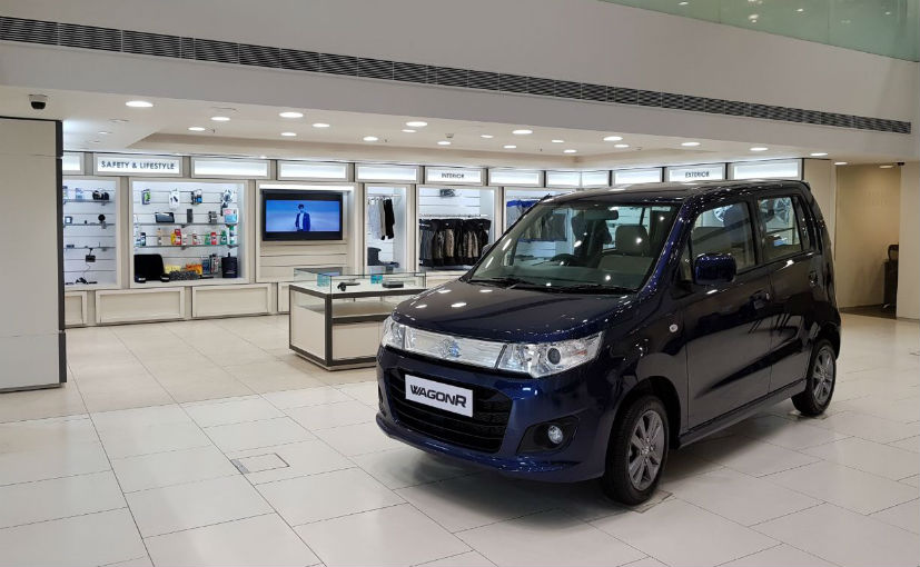
Maruti Suzuki is India’s largest car maker and sells over 1.4 lakh units every month. From the likes of the Vitara Brezza compact SUV to the likes of the popular Swift, Alto and Wagon R hatchbacks to the new Dzire compact sedan, Maruti Suzuki has over 2,050 showrooms in India in their standard dealership network. Until now, Maruti Suzuki showrooms have been pretty basic with a typically white and blue exterior look and a mundane interior design that isn’t really governed as such by the company. Now though, in line with the premium Nexa showrooms, Maruti Suzuki has given their mainstream showrooms a major and stylish makeover. The mainstream showrooms will now be renamed ‘Maruti Suzuki Arena’ with 80 showrooms getting an update in this financial year while the rest of the showrooms getting updated in the next five years. Read on to know more!

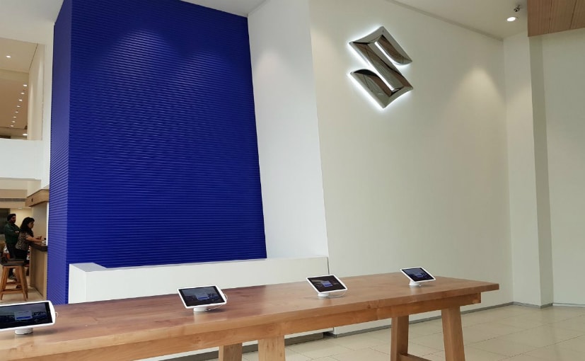
Our personal favourite in the new design element in the new Maruti Suzuki Arena showrooms has to be the marked out black pathway in the showrooms amidst the off-white or ivory tiling. Designed to look like a roadway, this black path will stretch from the centre of the showroom or the most prominent spot to the outside just by the door. This black pathway will serve as a display area for the latest launch car from the Maruti Suzuki stable and will be lit up by a top-lit panel of white flood lights. These white lights amidst the other warmer yellow lighting will be used to really focus the walk-in customer’s attention to the new cars. The new showrooms will now also have a dedicated delivery area that will be earmarked. This delivery area will also be used to showcase pre-booked test drive cars. The test drives will also now be registered either online or as a walk in customer via ipads that will be mounted on an entry desk.
On the whole, the new Maruti Suzuki Arena dealership look is certainly a huge leap in the right direction for the Indian automaker. A better atmosphere that looks more professional and upmarket certainly makes the customer feel more welcoming and thereby more willing to seal a deal. And the upmarket feel is exactly what Maruti Suzuki have managed to achieve successfully. In fact, the new dealership that we visited in New Delhi (where these pictures are taken) can easily be passed off as something as high end and cleanly designed as a Volvo dealership. And that, is high praise.